Time Series Forecasting Foundations: The Autoregressive Process and AR(p) Model
The Autoregressive process is a fundamental concept that underpins time series analysis and forecasting. It simply means that events in a time series are linearly dependent on their preceding/lagged events and therefore, future events can be modeled from past data. For example, you can model and predict the stock price of a publicly traded company using it's previously traded price.
The AR(p) Model
The Autoregressive process models time series as a linear relationship between the current value and previous values. A generalized AR($p$) is expressed mathematically as:
$$ y_t = C + \alpha_{t-p} * y_{t-p} + \epsilon_t $$
where
$y_t$: the present value
$C$: the constant
$\alpha_{t-p}$: the coefficient at lag $t-p$
$\epsilon_t$: error term/white noise
The general process for analyzing and modeling time series typically follows the following steps:
- 1. Data Visualization
- 2. Stationarity Test
- 3. Autocorrelation Determination
- 4. Model Selection and Fitting
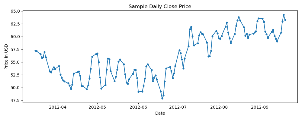
This note looks at the implementation of AR(p) model through the above steps using a sample set of the close price of a publicly traded company.
import numpy as np
import pandas as pd
import matplotlib.pyplot as plt

%matplotlib inline
%config InlineBackend.figure_format = 'retina'
stock_data = pd.read_csv('data/stock_price.csv', parse_dates=['ts'], index_col=['ts'])
stock_data.head()| close_price | |
|---|---|
| ts | |
| 2012-03-15 | 57.24 |
| 2012-03-16 | 57.14 |
| 2012-03-19 | 56.55 |
| 2012-03-20 | 55.79 |
| 2012-03-21 | 55.99 |
fig = plt.figure(figsize=(10,4))
plt.plot(stock_data.index, stock_data.close_price, '-o', markersize=3.5)
plt.title('Sample Daily Close Price')
plt.ylabel('Price in USD')
plt.xlabel('Date')
plt.tight_layout()
plt.show()
Stationarity and Differencing
When modeling time series data, it is often assumed that the data meets the stationarity condition. This condition implies that the statistical characteristics of the data, such as its mean, variance, and autocorrelation, remain constant over time. The rationale behind this assumption is that, if stationarity is present, we can make more reliable predictions about future observations.
In practice, raw time series data is frequently non-stationary, as it may be affected by trends and seasonal components. Thus, it is often necessary to transform the original data, typically through differencing, to achieve stationarity.
ADF Stationarity Test
To test for stationarity in a time series, we can use the Augmented Dickey-Fuller (ADF) test, which assesses the presence of a unit root in the series. The null hypothesis of the ADF test is that the series has a unit root, which implies that it is dependent on the root and not the time series itself, rendering it non-stationary. Conversely, if the series does not have a unit root, it is solely dependent on time, indicating stationarity.
Similar to other statistical tests, the ADF test produces a test statistic and a corresponding p-value. These results are used to determine whether or not to reject the null hypothesis of the test, which, in the case of the ADF test, is the presence of a unit root in the time series. The p-value represents the probability of obtaining the observed test statistic under the assumption that the null hypothesis is true. A smaller p-value indicates stronger evidence against the null hypothesis, and, therefore, a higher likelihood of rejecting it.
from statsmodels.tsa.stattools import adfuller

test_statistic, p_value = adfuller(stock_data)[:2]
test_statistic, p_value(-0.7170386326564675, 0.8422866474115657)
In our case, the p-value is $>.05$ which tells us that the time series is not stationary. In this case, transformations on the original dataset are necessary.
Differencing
Pandas and NumPy provide utility functions for differencing time series data. The following code snippet shows an implementation using the differencing function in Pandas, which has a default lag value of 1
differenced_df = pd.DataFrame( { 'diff_lag1' : stock_data.close_price.diff() })
differenced_df.head()| diff_lag1 | |
|---|---|
| ts | |
| 2012-03-15 | NaN |
| 2012-03-16 | -0.10 |
| 2012-03-19 | -0.59 |
| 2012-03-20 | -0.76 |
| 2012-03-21 | 0.20 |
test_statistic, p_value = adfuller(differenced_df.dropna())[:2]
test_statistic, p_value(-12.126294066508466, 1.7775373370590364e-22)
In this case, the p-value is $<.05$ which tells us that the differenced time series at $lag=1$ is stationary.
Autocorrelation and Partial Autocorrelation Function
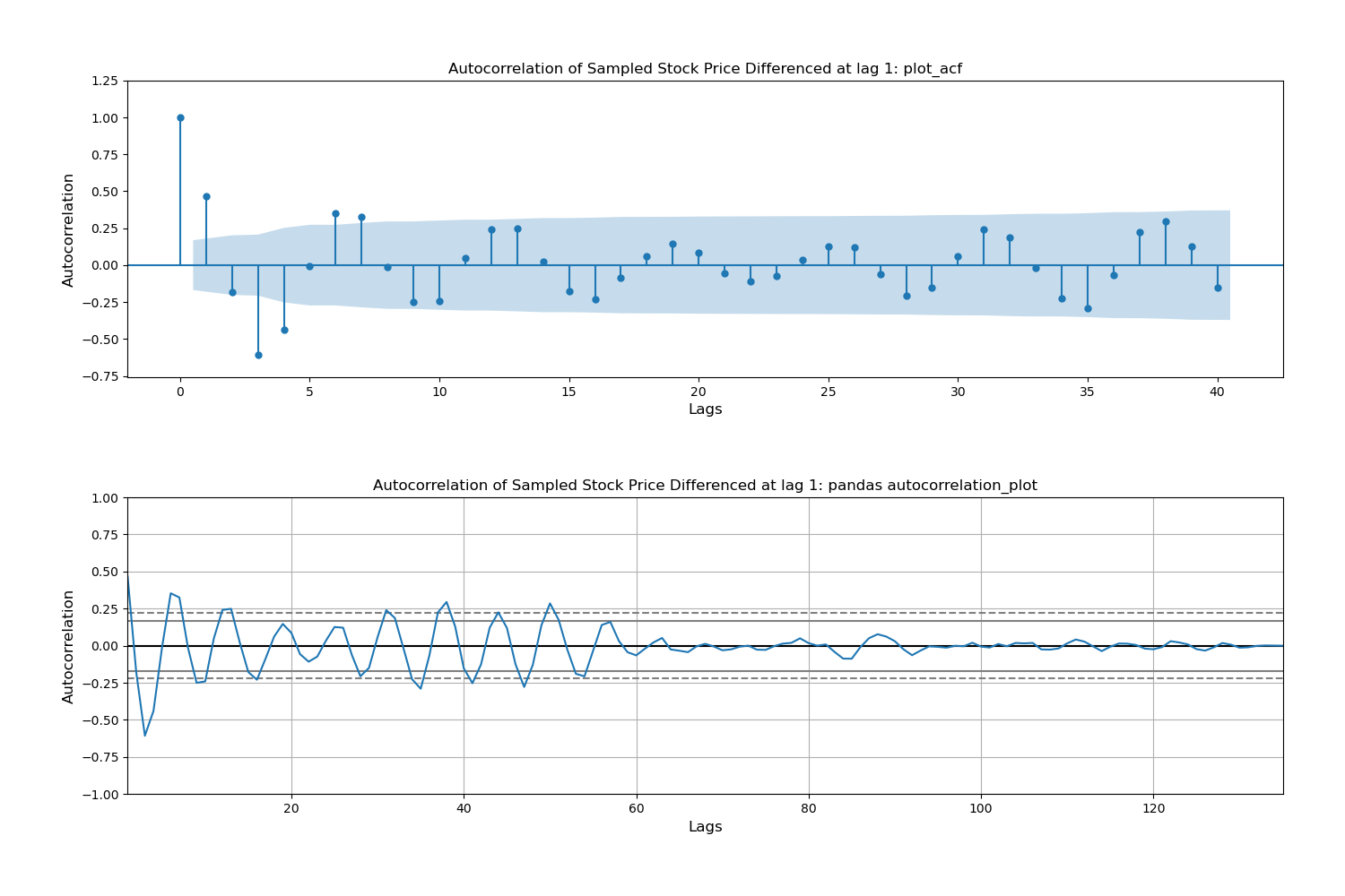
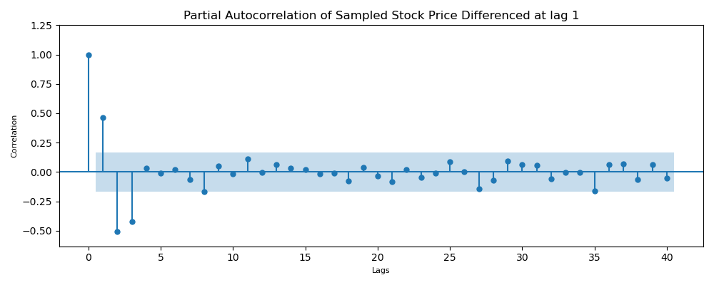
The autocorrelation function measures the linear relationship between values in a time series. It helps us determine the strength of the relationship between lagged values. However, it includes all lagged values. On the other hand, the Partial Autocorrelation function determines the linear relationship between two lagged values independent of values between them i.e. $y_{t}$ and $y_{t-3}$
Practically, the autocorrelation function tells us whether or not a time series has an autoregressive process and the partial autocorrelation function tells us which lags have a significant correlation which gets us to the parameter $p$.
Below is an example of how to generate acf and pacf plots. Note that by default, statsmodels and pandas use a 95% condidence level.
from statsmodels.graphics.tsaplots import plot_acf, plot_pacf

fig, ax = plt.subplots(2, 1,figsize=(15,10))

plot_acf(differenced_df.dropna(), lags=40, ax=ax[0],
title='Autocorrelation of Sampled Stock Price Differenced at lag 1: plot_acf', auto_ylims=True)
ax[0].set_xlabel('Lags', fontsize=12)
ax[0].set_ylabel('Autocorrelation', fontsize=12)


ax[1] = pd.plotting.autocorrelation_plot(differenced_df.dropna().values)
plt.title('Autocorrelation of Sampled Stock Price Differenced at lag 1: pandas autocorrelation_plot')
plt.xlabel('Lags', fontsize=12)
plt.ylabel('Autocorrelation', fontsize=12)

plt.tight_layout(pad=5.0)
plt.show()
The ACF plot shows a decaying autocorrelation which is a good indicator of an autoregressive process.
fig, ax = plt.subplots(1,1, figsize=(10,4))

plot_pacf(differenced_df.dropna(), lags=40, method='ywmle', ax=ax,
            title='Partial Autocorrelation of Sampled Stock Price Differenced at lag 1', auto_ylims=True)
plt.xlabel('Lags', fontsize=8)
plt.ylabel('Correlation', fontsize=8)
plt.tight_layout()
plt.show()
The PACF plot show that there is a significant autocorrelation between current time series values with the last 3 values (lag 3). This means that an $AR(3)$ process can best model the autoregressive properties of the data. With that in mind, lets can construct an autoregressive model.
Building the AR(3) Model
Below is the construction of the model using SARIMAX() method.
Note: Normally, I would do a train and test split but the idea of this post is less about examing ML protocols and more about the autoregressive process and model. That is, I'm using all the data as training data.
Initializing and fitting the AR(3) Model
from statsmodels.tsa.statespace.sarimax import SARIMAX

# Defining the model
ts_model = SARIMAX(stock_data.close_price, order=(3, 0, 0), freq='B')
results = ts_model.fit(disp=False)results.summary()| Dep. Variable: | close_price | No. Observations: | 136 |
|---|---|---|---|
| Model: | SARIMAX(3, 0, 0) | Log Likelihood | -204.566 |
| Date: | Sat, 08 Apr 2023 | AIC | 417.132 |
| Time: | 20:35:29 | BIC | 428.783 |
| Sample: | 03-15-2012 | HQIC | 421.867 |
| - 09-20-2012 | |||
| Covariance Type: | opg |
| coef | std err | z | P>|z| | [0.025 | 0.975] | |
|---|---|---|---|---|---|---|
| ar.L1 | 1.7094 | 0.078 | 21.880 | 0.000 | 1.556 | 1.863 |
| ar.L2 | -1.2233 | 0.153 | -8.017 | 0.000 | -1.522 | -0.924 |
| ar.L3 | 0.5137 | 0.093 | 5.528 | 0.000 | 0.332 | 0.696 |
| sigma2 | 1.1105 | 0.158 | 7.021 | 0.000 | 0.801 | 1.420 |
| Ljung-Box (L1) (Q): | 6.38 | Jarque-Bera (JB): | 2.34 |
|---|---|---|---|
| Prob(Q): | 0.01 | Prob(JB): | 0.31 |
| Heteroskedasticity (H): | 1.09 | Skew: | 0.21 |
| Prob(H) (two-sided): | 0.77 | Kurtosis: | 2.51 |
Making Predictions
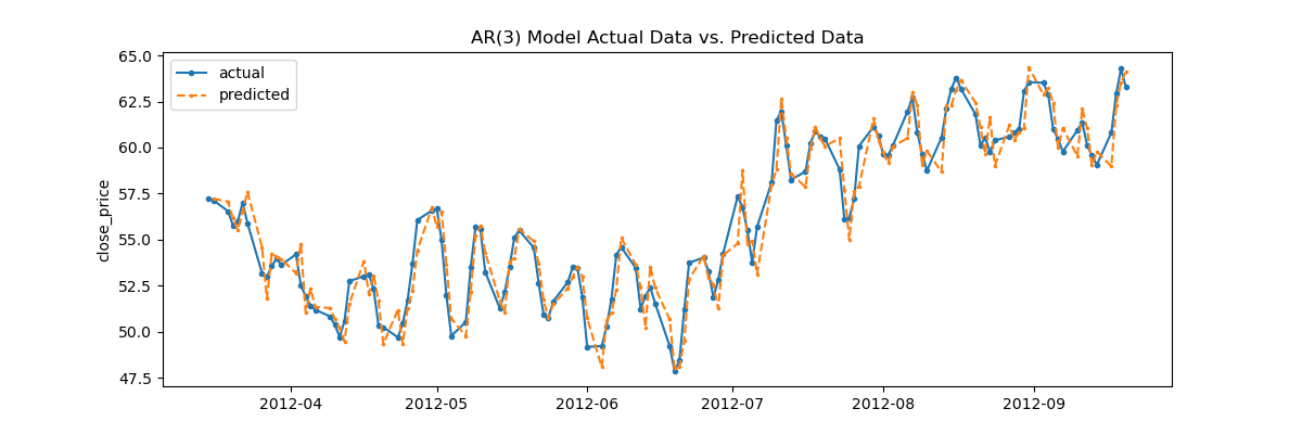
The model has been fit to the data and coefficient parameters estimated. Next step is to use the model to predict the data and assess the error rate.
stock_data['predictions'] = results.get_prediction().predicted_mean[1:]
stock_data.head()| close_price | predictions | |
|---|---|---|
| ts | ||
| 2012-03-15 | 57.24 | NaN |
| 2012-03-16 | 57.14 | 57.224363 |
| 2012-03-19 | 56.55 | 57.070173 |
| 2012-03-20 | 55.79 | 56.171639 |
| 2012-03-21 | 55.99 | 55.542841 |
fig = plt.figure(figsize=(12,4))
plt.plot( stock_data['close_price'], marker='o', label='actual', markersize=3  )
plt.plot( stock_data['predictions'], linestyle='dashed', marker='.', label='predicted', markersize=3)
plt.title('AR(3) Model Actual Data vs. Predicted Data')
plt.ylabel('close_price')
plt.legend()
plt.show()
MAPE for Model Fit Assessment
Visually, the AR model performs quite well in fitting the data. However, to get the exact error rate, we can use many loss functions. It is common in time series analysis to use MAPE. MAPE or Mean Absolute Percentage Error is defined as:
$$ mape = \frac{1}{n} \sum^N_{i=1} { \frac { | y_{actual} - y_{predicted} | } {y_{actual}} } $$
def mape(actual, prediction):
    return np.sum(np.abs( actual - prediction)/actual)/len(actual)
mape(stock_data.close_price, stock_data.predictions) * 1001.5450652440487085